![item image]()
30 Mar 2023
Author : Jocelyn Sagherian
$core_v2_ui.GetViewHtml($post.File.FileUrl, "%{ AdjustToContainer = 'true' }")
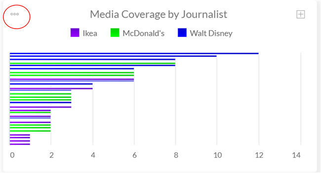
Nexis Newsdesk™ Tip of the Month: How to Change Colors on your Graphs and Charts
Looking to make your charts and graphs more personalized? Consider modifying the colors! After you create a graph, select the three dots on the upper left-hand side.
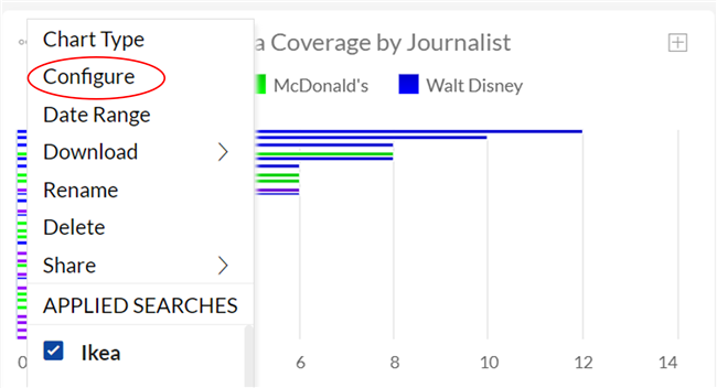
Choose “Configure”
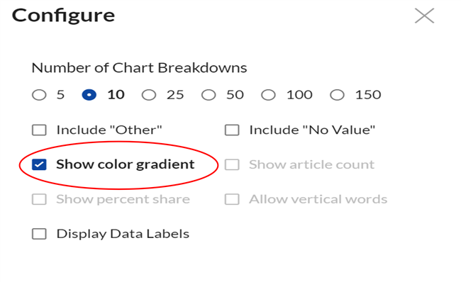
Select “Show color gradient:”
Once selected, you should be able to hover over your selected company:
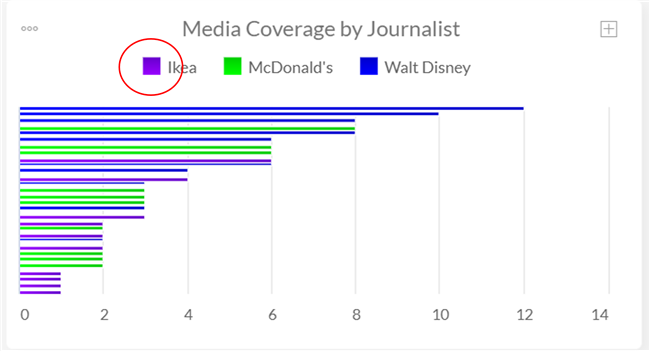
And select a color of your choosing!